Android TV App Development Fundamentals
The Leanback Support library provides all the libraries for creating Android TV apps. It includes APIs, resources and widgets to build apps for TV.
It makes building high-quality user experiences for big screen super easy.
Lets check out the Steps in detail while creating Android TV Apps.
1. Leanback Support Library is automatically added to our project when we create a Android TV project form the template using Android Studio.
dependencies {

    implementation "org.jetbrains.kotlin:kotlin-stdlib:$kotlin_version"
    implementation 'androidx.core:core-ktx:1.3.2'
    implementation 'androidx.leanback:leanback:1.0.0'
    implementation 'androidx.appcompat:appcompat:1.2.0'
    implementation 'com.github.bumptech.glide:glide:3.8.0'
}
2. We must declare an Activity for TV in the manifest using the Leanback Launcher Intent Filter.
<activity
    android:name=".MainActivity"
    android:banner="@drawable/app_icon_your_company"
    android:icon="@drawable/app_icon_your_company"
    android:label="@string/app_name"
    android:logo="@drawable/app_icon_your_company"
    android:screenOrientation="landscape">
    <intent-filter>
        <action android:name="android.intent.action.MAIN" />

        <category android:name="android.intent.category.LEANBACK_LAUNCHER" />
    </intent-filter>
</activity>
3. LeanBack Library also provides prebuilt fragments for browsing and interacting with media catalogs, and you can take advantage of this when you're building your own media browsing apps.
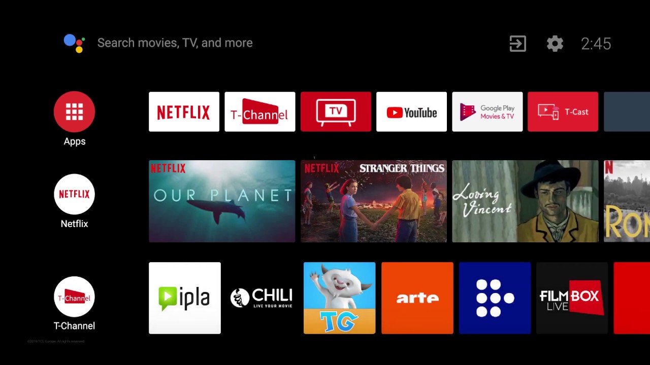
The BrowseFragment allows you to create a primary layout for browsing categories and rows of media items with minimum effort. Just adding this class to the layout has created a multi plane layout along with standard navigational design and polished transition animations.
So how we populate the layout of the fragment with some content?
- A single ArrayObjectAdapter is used to define a list of ListRow objects.
- A ListRow presenter is used to display them.
- Categories are automatically displayed vertically on the left.
- Media for each category is horizontally scrolling list.
- As the user drills deeper into the category. The category themselves will collapse and will be displayed as per row as a header item.
- Each ListRow object is composed of one header item and another ArrayObjectAdapter.
- The header item describes the metadata of this row -- in this case, the category name.
- And the ArrayObjectAdapter contains the media items for each category.
- Here a user defined CardPresenter is used to display each media item. You need to present this yourself.
- All of these classes -- ArrayObjectAdapter, ListRepresenter and ListRow are provided by the Leanback Support Library.
class CardPresenter : Presenter() {

    override fun onCreateViewHolder(parent: ViewGroup): Presenter.ViewHolder {
        Log.d(TAG, "onCreateViewHolder")

        val cardView = object : ImageCardView(parent.context) {
            override fun setSelected(selected: Boolean) {
                updateCardBackgroundColor(this, selected)
                super.setSelected(selected)
            }
        }

        cardView.isFocusable = true
        cardView.isFocusableInTouchMode = true
        updateCardBackgroundColor(cardView, false)
        return Presenter.ViewHolder(cardView)
    }

    override fun onBindViewHolder(viewHolder: Presenter.ViewHolder, item: Any) {
        .....
    }

}

Comments
Post a Comment